How to make your brand look awesome when you don’t know what you want!
This morning I received a press release about how the pandemic has led to consumers being more influenced by packaging and branding.
It was a handy reminder of how important ‘packaging’ and ‘product’ imagery are whatever it is you’re selling.
Which got me to thinking about the process I used to get the logos right for both my podcasts, and how it is a process that can be used for any brand or design project.
The process I went through would work for any brand / logo / parcel packaging / product packaging ideas you have, (I’ve also used it for book cover design).
It’s something that seems to be very well known in the content world, but less well known in the eCommerce world, so I thought I should spread the word.
So here goes – my process for creating awesome artwork when you don’t know exactly what you want…
Step 1: Pre-briefing research
The whole process has to start with research.
I started by looking at the competition in the places where my target customer would be choosing between my show and someone elses.
So I logged into Apple podcasts and looked at the podcast designs that came up top 10-20 when I did the following:
- Looked at the Marketing and Business and Entrepreneurship Categories in the UK and USA
- Searched for “marketing” and “eCommerce” in the UK and USA
Then repeated the process for Spotify.
Three ‘rules’ quickly stood out:
- the logos are square
- the logos are TINY so the name and message needs to be big and clear
- half the time hosts include their picture – to include a photo or not?
(and yes I learnt a lot about titles, and descriptions at the same time!)
Plus lots of other common design themes – which I wanted to ape, but not completely submit to.
I want my show to look like it belongs, but not to just be one of the crowd.
Where to do this research for eCommerce designs:
For an eCommerce business logo I’d search on Google to see who else is selling your type of product.
For product packaging I’d go to a supermarket or somewhere where a lot of similar products are sold. Photograph lots, and buy a few.
For shipping boxes I’d order from a few competitors, and industry leaders but also check out the blogs of the companies who supply the best packaging. Branded boxes are not as widespread as they should be, so you’re going to have to look wider to find great examples.
Ste p 2: Turning the research into a design brief
As well as the research results I had brand guidelines I could share (colours, styles, existing artwork) with the designer.
But when put together they just didn’t give a brief clear enough to send it to one of my normal designers.
I knew I needed to see lots of ideas before I could work out what I needed in my logo.
So I decided to crowdsource the design by running a competition on 99designs.
A design competition?
Yes.
I paid the podcast logo design fee (so the graphic designers know what the prize for winning the competition will be).
I put the bare bones of my brief (the brand guidelines, details about the show, the key lessons from the research, details of what I knew I didn’t want) up onto 99designs and used their platform to invite anyone and everyone who wanted to create designs for me.
And I sat back and waited.
Every day the competition was live (sometimes multiple times a day) I’d login and reject the awful ones, and give feedback to the best.
Back in 2015 I worked through about 50 designs for eCommerce MasterPlan, and this year for Keep Optimising nearly 200, because 99designs now have a much bigger group of designers working for them.
The designers came up with ideas I would never have thought of!
Over 4-5 days I whittled it down to a couple of designers and a handful of designs.
Which meant it was time to find out what other people thought about the designs…
Step 3: Getting customer and team feedback
I only know what I know. So it’s always important for me to get feedback from other people invested in the project.
So once I had got to some designs I was happy with I needed to get the perspective of two important groups:
- My team who’ll be working on the podcast, and have a good idea of what we’re trying to achieve
- My target audience – if they don’t like it, they’re not going to listen!
Getting team feedback
I wanted to only ask the customer base once, so it was down to my team to help get the options down to the last 2.
These 8 I shared with my team and the general consensus was “We love the up and to the right arrows!”
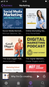
Checking how it looks in the real world
It looked like the decision was about to passed over to the target customers… however – it’s always good to check what the logo will look like where the target customers are actually going to see it.
In this case that meant mocking up what it’s going to look like in Apple Podcasts.
Can you spot the obvious problem?
Yes – my podcast artwork was going to point people to listen to other people’s podcasts! I’m sure Amy Porterfield and Daniel Rowles and Ciaran Rogers from Digital Marketing Podcast wouldn’t have minded at all – but this was terrible news the team’s favourite 2 designs.
But it did cut back our list to 2 core designs. Which I finalised with the 2 designers so I could get the target listeners to feedback.
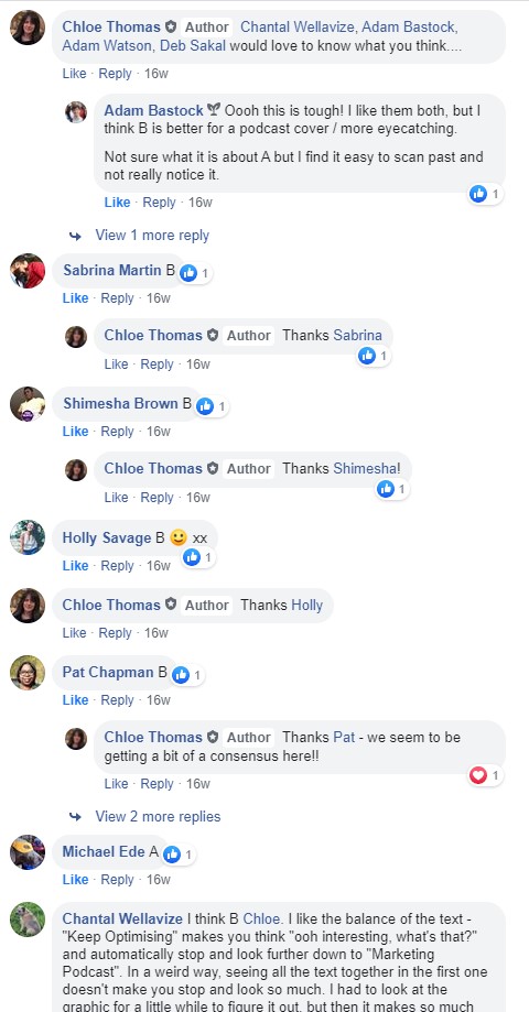
Getting customer feedback
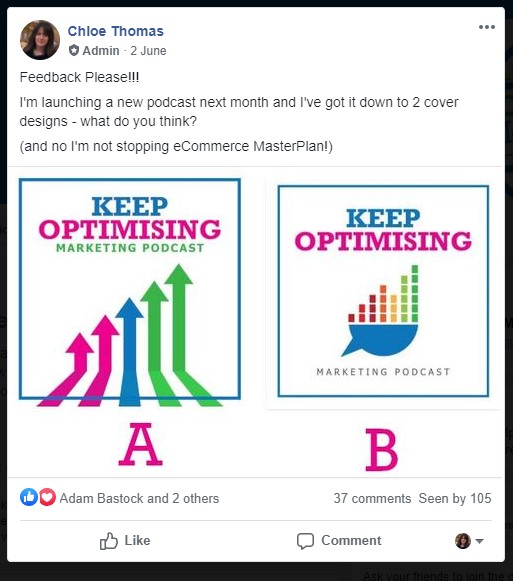
This image was shared in our Facebook Group, where the most passionate and opinionated of our listeners hang out.
And the response was very clear!
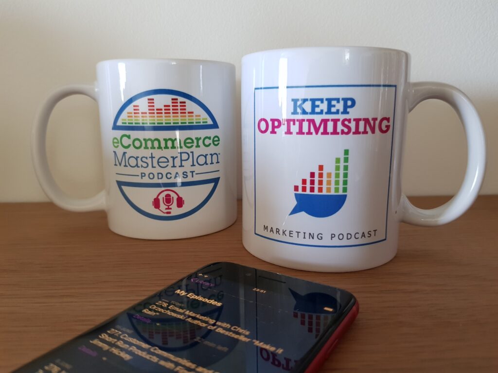
Step 4: The result
So B is now our podcast logo.
I would NEVER have come up with the speech bubble / graphs idea. It’s perfect. It’s strong, it sits really well alongside the eCommerce MasterPlan podcast logo, and it stands out really well in Apple Podcasts.
Best of all as I know the audience like it.
Without the competition/crowdsourcing angle that 99designs makes it possible to leverage I wouldn’t have ended up with such strong logos.
I also really like that the whole IP (Intellectual property) side of things is just dealt with – I own the logo, no one else can use it, the designers can’t claim it’s theirs later. It’s all mine, which on day one of a product or a company or a podcast might not seem important, but it becomes much more so further down the line.
I really recommend this process if you’ve really important graphic design to be done.
In the five years between my podcast logos I was really impressed with how the 99designs platform has evolved.
The competition is a lot easier to manage, the quality of the designers just as great (and there’s more of them!), and the range of designs you can do has grown a LOT.
The most useful ones for eCommerce are:
- Logo and Brand Identity
- Site graphics
- Social media pages
- Product packaging and labels
- Postcards and flyers (get them in your parcels!) and other direct mail items
- Sticker design
- T-shirt and other clothing designs
- Parcels to ship your products in
Plus LOADS more.
Get $20 off your first 99designs project
As you can tell I really love working on the 99designs platform, and with their designers.
It’s a great service, at a great price AND I’ve struck a deal with them so you can save $20 on your first design project.